Reflection
Working closely with the client helped me translate her voice into visuals that felt true. Collaboration was a big part of finding the right balance between creativity, clarity, and authenticity.
Outcome/Wins
-
Brought the brand’s personality to life through color, copy, and texture
-
Turned a messy, unsure brief into something clean, bold, and memorable
-
Got genuine positive reactions from the client
Core Applications
Jar Label


Market Banner

Sandwich Board

Logo Suite

Icon

Primary Logo
longform
The Process
Customer Persona
Richmond’s millennial food lovers – the type of people who shop local, value bold flavor experiences, and see food as a form of self-expression. These are the customers frequenting farmers markets, community events, and small-batch pop-ups. They want more than just a condiment; they want a story and personality behind what they buy.
Playful and spicy
Bold yet approachable
Local, Fresh, Handmade
Moodboard


Brand Identity
for a Local
Kimchi Maker
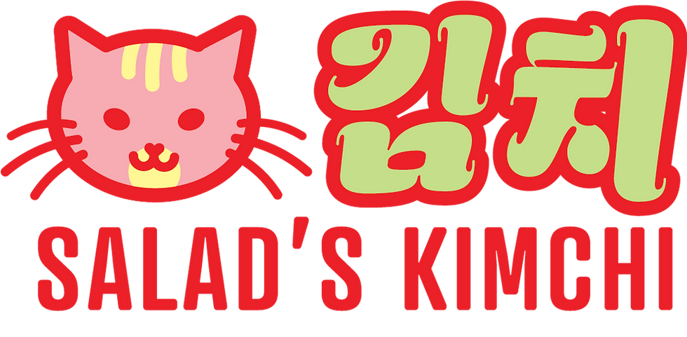
SALAD'S KIMCHI
2025
Here's the gist
Salad’s Kimchi is a small-batch, handmade kimchi brand. Guided with with family recipes, the founder worked to create the bold, complex flavors she felt were missing from the market. The name for her brand was inspired by her cat, Salad—a fiery, quirky tabby cat with as much spicy attitude as the kimchi named after her.
She asked me to make her a label for her jars, just enough to get her selling in small batches.
How'd it go?
I gave her the label designs in an easily printable format, as well as connecting her with a local printer capable of completing her needs. In addition, I designed a banner and sandwich board, getting her farmers-market ready.
Identity Development
Colors

Picking colors was simple – I wanted a bright and fresh feel for the brand, just like the flavors of kimchi. The pink and yellow emphasize the feminine aspect of the brand, adding depth to the cute and bold character of Salad the cat.
Type

